The Ultimate Beginner's Guide on How to Read Candlestick Charts
Updated December 23, 2024.

Do you remember the first time you bought a stock? You may have had quite the emotional ride, the thrill that you could turn over a handsome profit. Unfortunately, your first investment had a sharp selloff, forcing you to sell too early before the security recovered. Your emotions got the better of you, but consternation also infiltrated the broader equities arena. Surely, there must be some type of assistance to ensure you stay the course and generate profits.
Well, thankfully, there is.
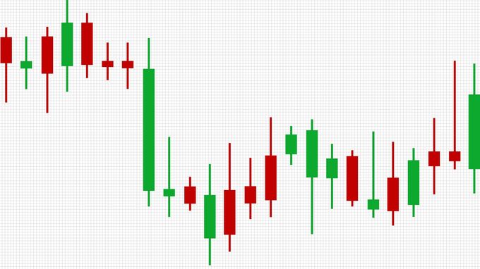
When you begin trading in the financial markets and start utilizing the same tools and resources as the professionals on Wall Street, the go-to source is the candlestick graph. Upon first glance, you might be taken aback by a stock market candlestick, prompting you to learn how to read candle charts.
This guide is here to teach you, and we'll begin with the fundamentals.
What Exactly Is a Stock Candlestick?
This is one of many charts that allow investors to determine the potential price movement during a specific period by identifying previous patterns.
It is a common visual aid utilized by beginners and seasoned veterans alike. But what else do you need to know about the technical analysis candlestick chart?
Candlesticks function similarly to a bar as they tell you the market's open, close, high, and low price during the trading session.
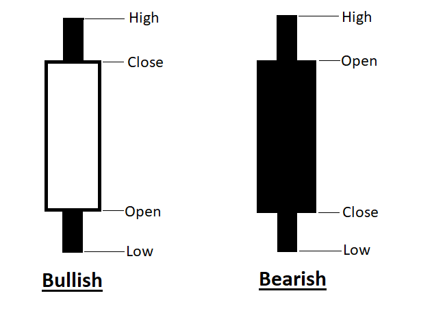
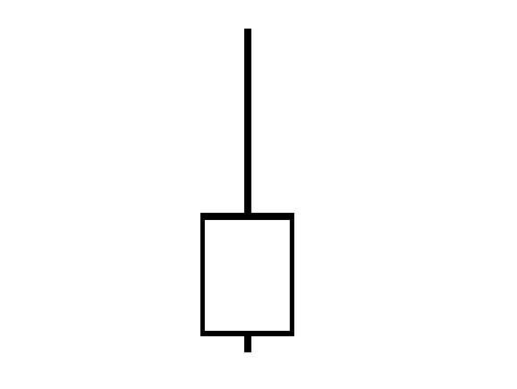
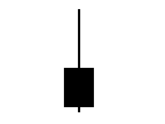
The candlestick has a real body, which is the wide part you will see on the chart. This is the price range between the open and close price for the trading session. If the real body is filled in with black, the closing price was lower than the open. If the real body is empty, the closing price is higher than the open.
Many traders will typically alter the shades. A down candle is colored red rather than black, while an up candle is filled in with green instead of white.
The lines on the top or bottom of the real body are the high and low prices of the day's trading. These are known as either shadows or wicks. The length determines the difference between the potential lowest prices and the difference between the potential opening or closing prices.
If the upper wick on a down candle is short, the opening price was close to the high of the day. A short upper wick on an up candle shows that the closing price was near the high of the session. The lower wick spotlights the lowest value of the trading day.
Why Are Candlestick Charts Useful?
Knowing how to use candlestick charts is essential to trading stocks, especially if you want it to be an income generator.
But how does it work anyway?
Here is a rundown of candlestick patterns explained with examples.
The body is a tremendous visual aid as the color-coding can better showcase the difference between the opening price and the closing price.
The Colors and Sizes of the Boxes
Red-filled candlesticks highlight selling pressure, while a red hollow candlestick is created when the close is above the open.
Black-filled candlesticks highlight when the close is below the open, while black or green hollow candlesticks suggest strengthening buying pressure (prices are higher after the open, and the close was above the previous closing price).
A long candlestick body spotlights buying interest and a strong price move, while a short candlestick body indicates less buying interest and smaller price movements.
The Lines
The lines, or wick, are important as they represent the high or low range for the period you are monitoring or researching.
Moreover, when novice traders are researching technical analysis, they will come across the tick chart vs. candlestick debate, but it can be a complementary tool since a tick chart represents the number of transactions in any given period.
Remember, not every trader will use one method. Successful investors use multiple resources.
The overall candlestick chart is essential because they identify the four crucial price points:
- Open The opening price at the start of the session
- Close The closing price from the previous session
- High The price of the high during the session (intraday)
- Low The price of the low during the session (intraday)
Essentially, the candlestick open and close is imperative to the efficacy of your trading endeavors.
The above image determines the open and close points of bullish stocks (one that experts and investors think is about to increase in value) and bearish stocks (one that the experts believe will decrease in value).
One-Candle Signals
A single candlestick pattern is essentially a pattern formed by one candle. The time frame is shorter as the trading signal is based on the price movements of a single session.
Here are a few patterns associated with the one-candle chart:
Hammer
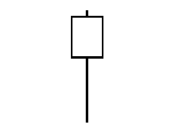
A bullish reversal that is created during a downtrend. It appears as the last candlestick in a downtrend before an uptrend, and the appearance is a long lower wick and a shorter body at the top with a small upper wick.
Hanging Man
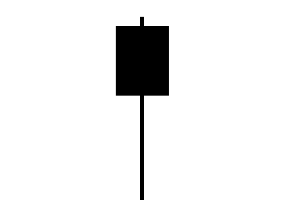
A bearish signal that suggests a reversal pattern is here, with sellers outnumbering buyers. Unlike the hammer, the hanging man appears at the top of an uptrend before a downtrend and looks like a small body, a long lower shadow, and hardly any shadow on top.
Inverted Hammer
A trend reversal signal that suggests bulls want to buy the stock at slumping prices. The inverted hammer appears as an upside-down version of the hammer candlestick pattern at the bottom of a downward trajectory.
Shooting Star
A bearish reversal indicator that looks similar to the inverted hammer, but it happens at the top of an upward trajectory. When the prices trend higher, it will look similar to a shooting star.
Doji
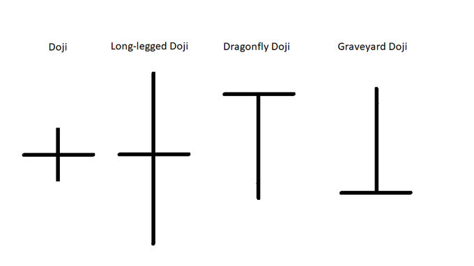
A Doji Japanese candlestick pattern is when a stock or currency pair's open and close are equal for a specified time. This could signal a reversal pattern.
There are generally two ways to spot a Doji formation.
The first is if the candlestick appears as a "plus" sign. The second is if prices move lower at the opening bell and then slightly higher in the opening minutes of the session.
There are also four different types of Doji patterns:
Patterns in Candlestick Graphs
The diverse array of patterns that form when studying candlestick graphs is critical to technical trading. By using them to your advantage, you can come across potential market trends and establish trading strategies and tactics from your understanding of these trends.
That said, here are some patterns you might notice and how to identify them:
Piercing Pattern
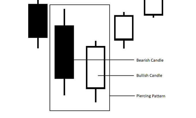
A piercing pattern is a bullish trend reversal that forms at the end of a downtrend.
Since this requires two candlesticks, you can identify the pattern by homing in on two developments:
- The bullish candle opens lower than the close of the bearish candle
- The bullish candle closes above the 50% level of the bearish candle.
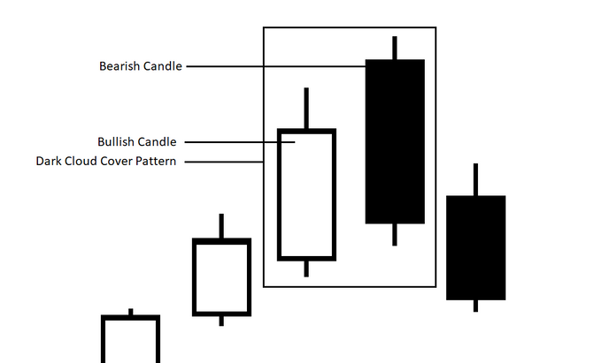
Dark Cloud Cover
A dark cloud cover is a transition in momentum to the downside after a rally in the security's price.
You can identify a dark cloud cover pattern by looking for these five elements:
- A bullish trend.
- A bullish candle in that upward trend.
- A gap up on the next session.
- Positive momentum, driven by positive and unexpected news, diminishes.
- The bearish candle ends the session below the midpoint of the previous bullish candle.
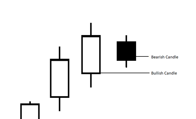
Bearish Harami
A bearish harami is a two-bar candlestick pattern that forecasts prices going through a reversal on a downward slope. It also suggests a top has been reached.
Traders can locate a bearish harami if the momentum is starting to slow, like a bearish moving average crossover.
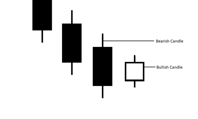
Bullish Harami
Like multiple of the candlestick patterns discussed here, a Bullish Harami is just the opposite of another variant (the Bearish Harami.
Candlesticks Visualize Emotion
If you ever wanted to visualize emotion in the stock market or forex arena, the candlestick graph is the best way to achieve this. Be it green candlesticks or long candlesticks, you are witnessing how the market is performing in real-time with the help of visual aid.
As long as you know how to read a candlestick stock chart, you will not only profit from your investment strategies, but you could potentially find great amusement in how the market operates on a day-to-day basis.


